Slyceup


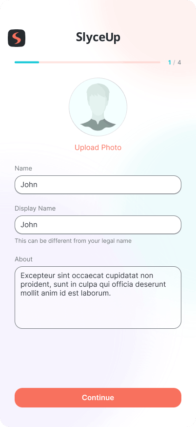
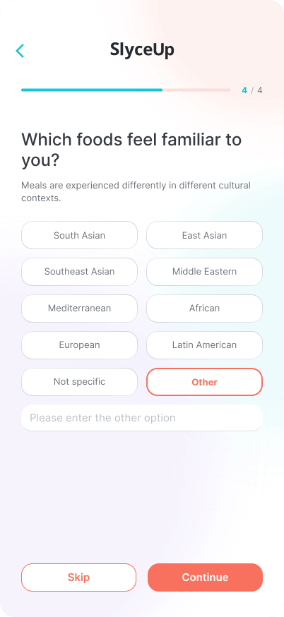
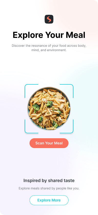
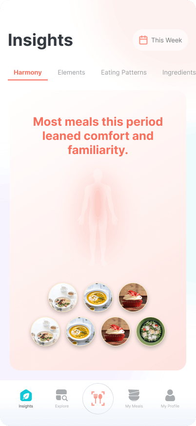
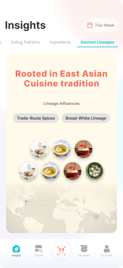
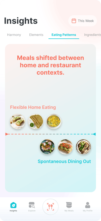
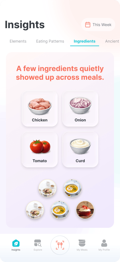
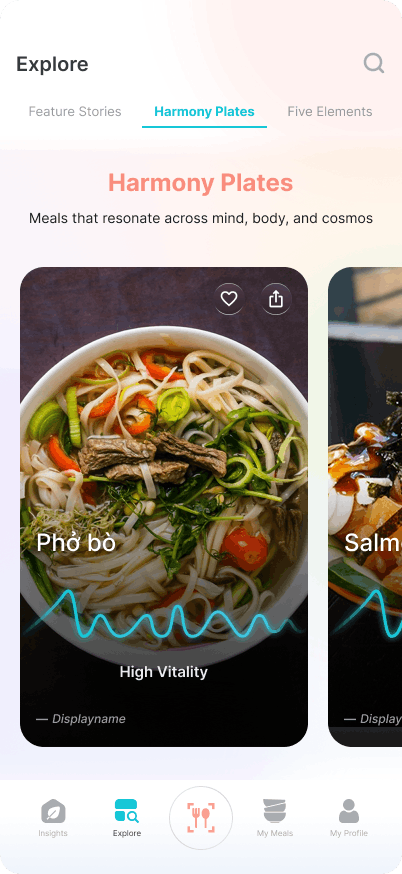
My Role

UX Research

Product Thinking & Strategy

Wireframe

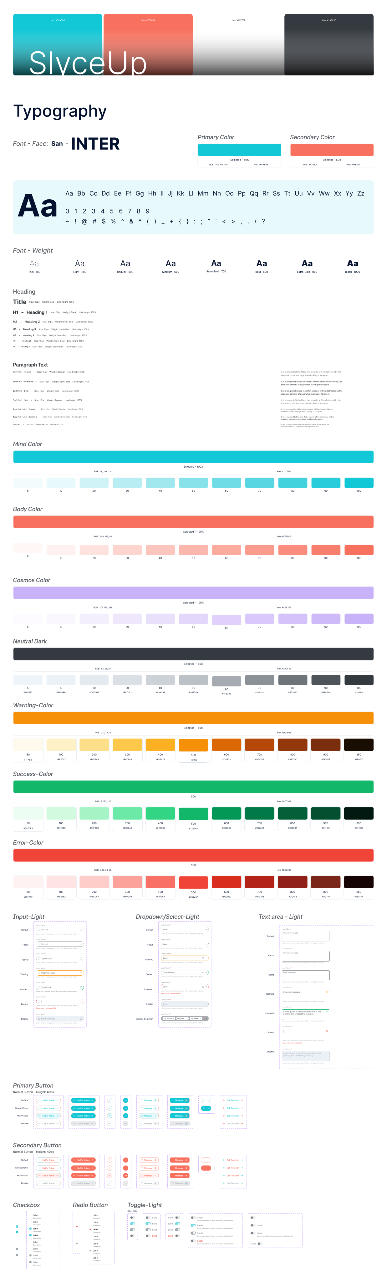
Design System

Interaction Design
01 – Overview
Beyond calories — understanding the story of your food
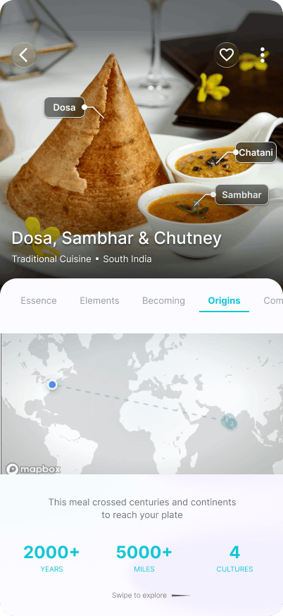
SlyceUp is not a nutrition tracker. It’s a food intelligence platform that answers questions most apps never ask: Where did this ingredient come from? What tradition does this dish belong to? How do these elements interact inside my body? What patterns am I forming over time?
SlyceUp was designed to deepen this proposition — moving from a feature-level experience into a coherent system that connects meal capture, ingredient lineage, elemental wisdom, and personal eating patterns into one legible whole.
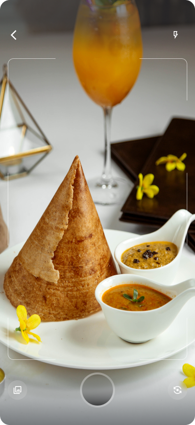
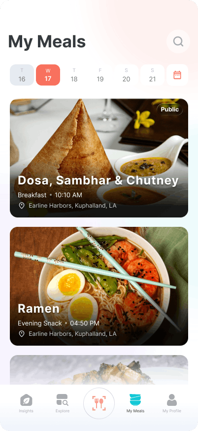
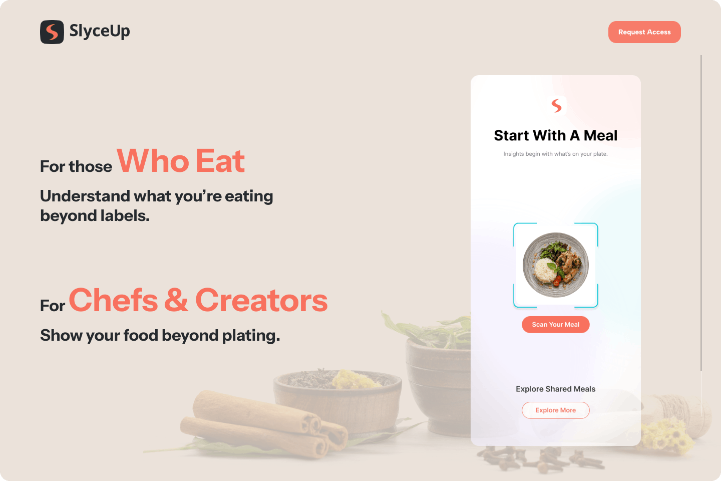
📸 Meal capture
Photo, voice, or text — any meal logged becomes a data point with depth
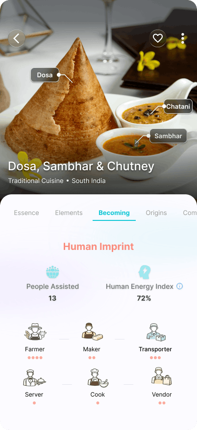
🌿 Ingredient origin
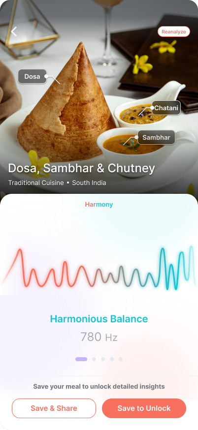
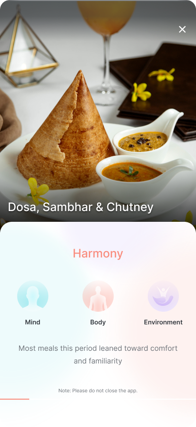
☯️ Elemental harmony
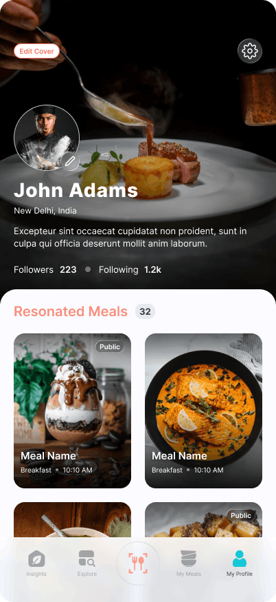
🔁 Eating patterns
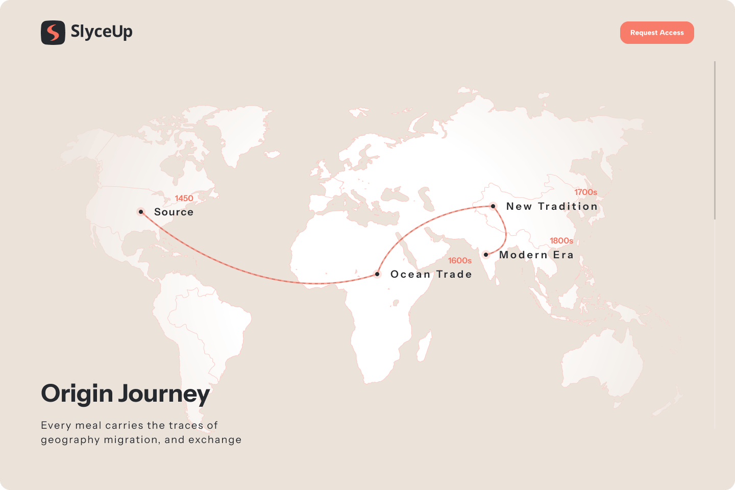
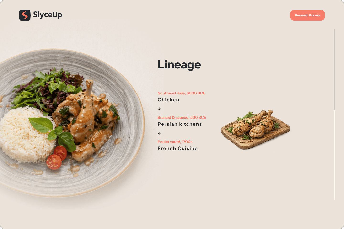
🏺 Ancient lineages
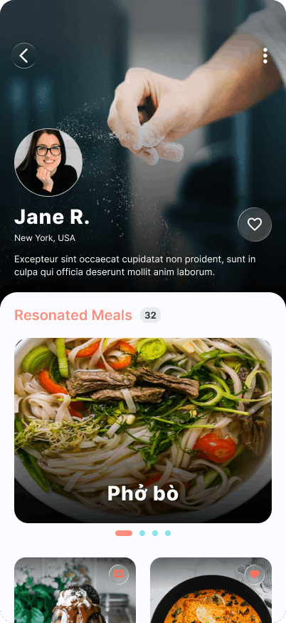
💡 Personalised insights
02 – The Problem Space
Why existing nutrition apps fall short for this user
The people drawn to SlyceUp aren’t looking for macros. They’re people who already feel some pull toward food as culture, medicine, or ritual — but have no tool that meets them at that level of curiosity.
Depth without context
Disconnected lineage data
Harmony as a hidden feature
Patterns invisible over time
03 — Research Approach
A mixed-methods plan built for depth, not breadth
Standard nutrition app research focuses on logging frequency and feature usage. For SlyceUp, that was insufficient. The core research question was not “can users log a meal?” — it was “do users feel that SlyceUp understands their relationship with food?” That required a different methodological posture.
Exploratory interviews (n=14)
60-minute semi-structured sessions with users who self-identified as “food-conscious” — practitioners of Ayurveda, whole-food advocates, ancestral diet followers, and culinary hobbyists. Focus: their existing relationship with food philosophy, not app usage.
Meal journal diary study (n=10, 21 days)
Participants kept a written journal alongside V1.0 app usage — recording what they wished the app had told them after each meal. This surfaced the gap between what the app provided and what users were hungry to know.
Expert consultations (n=4)
Sessions with an Ayurvedic practitioner, a TCM nutritionist, a food anthropologist, and a regenerative agriculture researcher — to validate the accuracy of lineage and elemental frameworks in V1.0.
Depth without context
Participants sorted 40 potential insight types (elemental, pattern-based, lineage, origin, seasonal) to understand which clusters felt coherent and which felt arbitrary. Directly shaped the V2.0 insight architecture.
Usability testing — hi-fi prototype (n=10)
Moderated sessions on the V2.0 Figma prototype. Five core tasks tested: meal capture, ingredient deep-dive, harmony view, lineage exploration, and pattern report reading. SUS collected post-session.
04 — Users
Sanya, 31
“I already follow a sattvic diet roughly. I want something that tells me whether what I’m eating actually aligns — not just whether it’s healthy by Western standards.”
Karan, 38
“I’m not spiritual about it. I’m just curious. I want to know the story of my food — where the turmeric came from, what tradition used it and why.”
Every other app tells me I ate 420 calories. I already know that. I want it to tell me that I’ve been eating cold and heavy foods for three weeks and I should think about what that means.
— Sanya, exploratory interview session 4
05 — Key Research Findings
What users actually wanted from a harmony experience
I didn’t realise I’d been eating almost no bitter or astringent foods for a month. When the app showed me that pattern and linked it to Ayurveda’s six tastes, it actually changed what I cooked that evening.
— Karan, diary study week 3 reflection
Wisdom over data
Lineage needs a personal hook
Static encyclopedia content on Ayurveda or TCM created no engagement. The moment it was tied to something the user had actually eaten that day, engagement spiked dramatically.
Origin creates emotional value
Patterns need time and narrative
Users with under 2 weeks of data didn’t engage with pattern insights. At 30+ days, pattern views became the most-revisited section — but only when framed as a story, not a chart.
06 — Usability Testing Results
Hi-fi prototype validation (n=10)
I went into this expecting another health app. I came out feeling like someone had finally made a tool for the way actually relate to food. The ancient lineages section felt like reading — I didn’t want to stop.
— Usability participant 7, post-session debrief
84/100
88%
9/10
Key Features
Meal capture: Any format, instant recognition, origin tagged on log
Ingredient origin: Geographic provenance, cultural context, seasonal state
Elemental harmony: Five elements + six tastes mapped to every meal
Meal Insights: Ayurvedic Vata/Pitta/Kapha alignment, personalized
Ancient lineages: Ayurveda, TCM, Mediterranean, Indigenous—contextual
Eating patterns: 30-day rhythm, imbalance detection, narrative summary
Harmony view as primary card
Iterate: Lineage navigation
Watch: Capture friction
Ingredient origin layer
Measure: Pattern report engagement
Future: Seasonal intelligence
Research Reflections
What this project changed about how we approach nutrition UX
Nutrition apps have been designed for compliance — logging streaks, calorie targets, macro goals. SlyceUp’s users want comprehension, not compliance. Designing for curiosity requires a completely different interaction model.
Ancient systems like Ayurveda and TCM are not “alternative” — for many users they are primary. Treating them as supplementary content rather than core framework was V1.0’s biggest category error.
The diary study’s “what did you wish the app told you” prompt was the single most generative research technique in the project. It surfaced desire-space the users themselves couldn’t articulate in interviews.
Expert consultation with practitioners — not just users — was essential for getting harmonic and lineage frameworks right. Accuracy matters here. A wrong Ayurvedic mapping isn’t just a UX error, it erodes trust with the most engaged segment.
Narrative always outperforms data visualisation in this domain. Users who skipped chart-based pattern views read the same content when it was written as a paragraph. Format is meaning.